A space for visual experiments, interfaces, ideas and everything that happens behind the finished work. Some become projects. Some simply help us understand what comes next.
01VISUAL CAMPAIGN
VISUAL CAMPAIGN
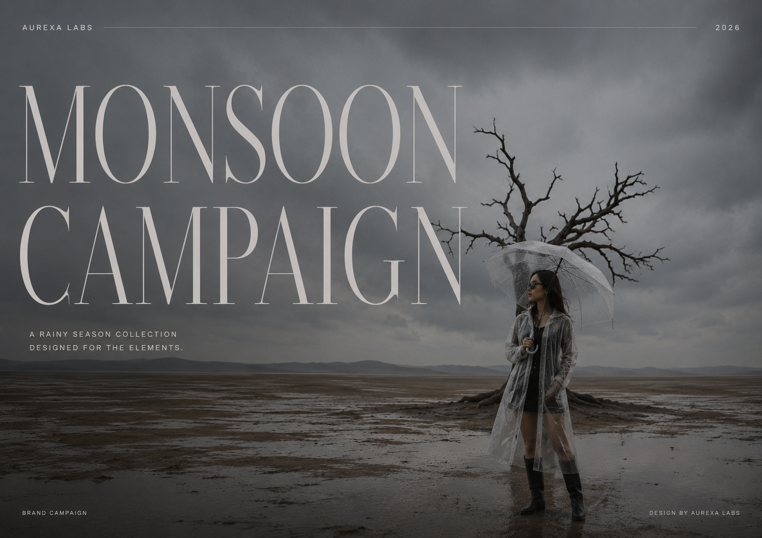
DESIGNED FOR THE RAIN.
A visual campaign built around the mood of the monsoon — combining atmospheric photography, oversized editorial typography and a muted palette to create a sense of quiet drama. The composition brings fashion and environment together, turning a rainy landscape into a strong visual identity.
DESIGNERAnshika
ROLEArt Direction · Visual Design
02BRAND / VISUAL DESIGN
BRAND / VISUAL DESIGN
COFFEE, WITH CHARACTER.
A visual identity study for a coffee concept built around warmth, simplicity and personality. Bold typography, rich coffee tones and a close-up product composition create a playful campaign language that feels approachable while giving the product a strong visual presence.
DESIGNERAnshika
ROLEBrand Design · Visual Direction
03DIGITAL EXPERIENCE
DIGITAL EXPERIENCE
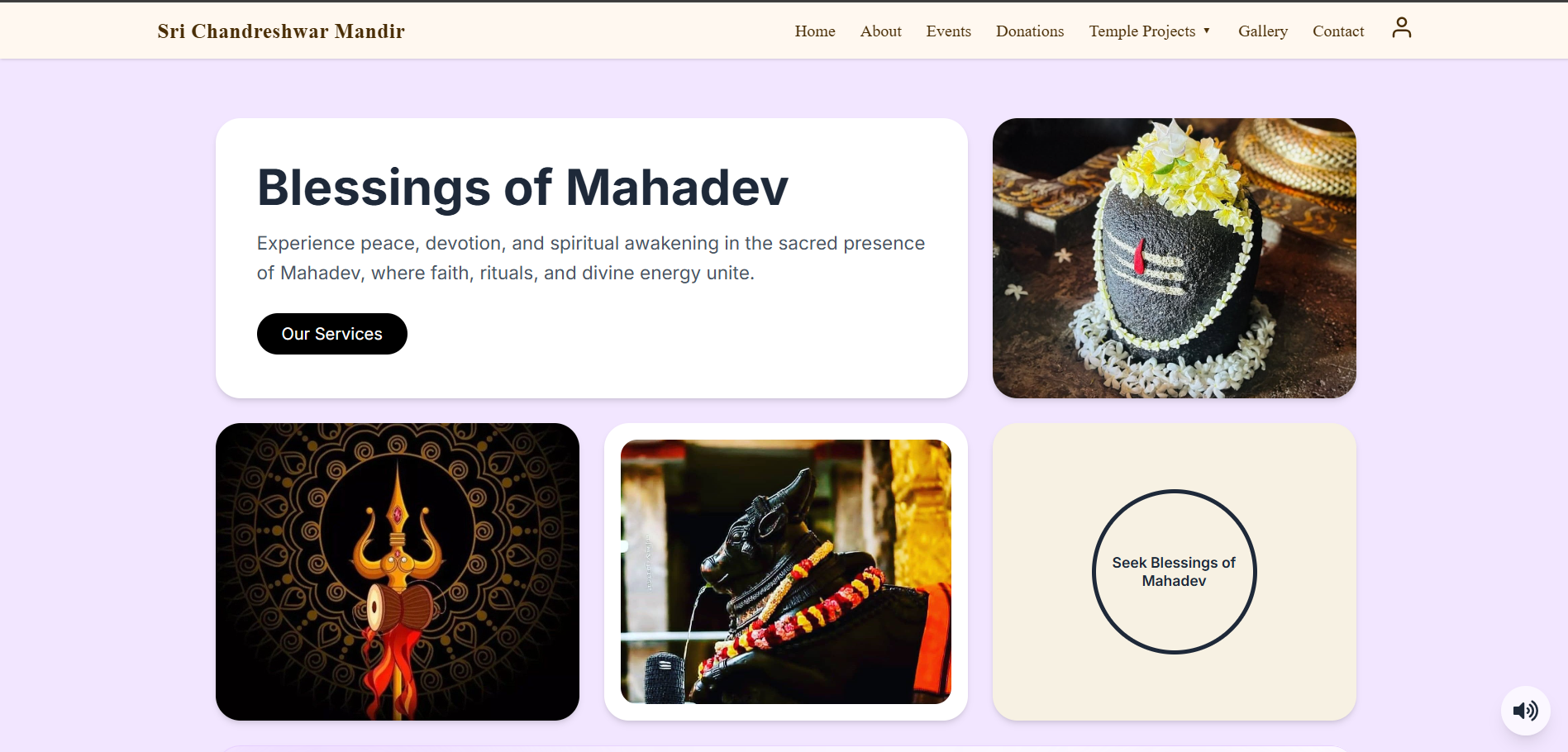
A DIGITAL HOME FOR DEVOTION.
A digital experience created to bring the spiritual identity of Chandreshwar Mandir into an accessible online space. The design combines a calm visual language, devotional imagery and simple navigation to make temple information, events and spiritual experiences feel clear, welcoming and connected.
DESIGNERAnshika
ROLEUI / UX · Visual Design · Development
04WEB / UI DESIGN
WEB / UI DESIGN
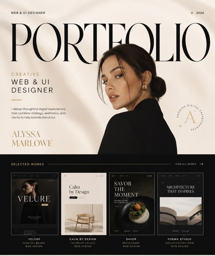
A PORTFOLIO WITH A POINT OF VIEW.
A personal portfolio concept designed to turn a body of creative work into a distinct digital identity. Editorial typography, restrained layouts and carefully framed project previews create a visual experience that feels personal, confident and focused on the work itself.
DESIGNERAnshika
ROLEWeb Design · UI / UX · Visual Direction
05TYPOGRAPHY / IDENTITY
TYPOGRAPHY / IDENTITY
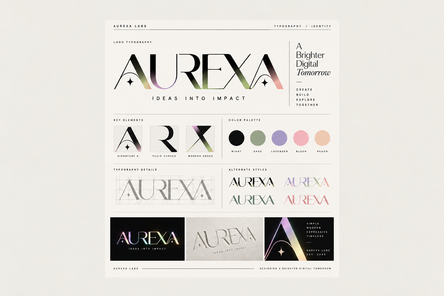
A WORD, MANY DIRECTIONS.
An exploration of Aurexa's visual identity through typography, proportion and colour. Different letterforms, compositions and treatments were tested to understand how one name could take on different personalities while still feeling recognisably Aurexa.
DESIGNERAnshika
ROLETypography · Brand Identity · Visual Design
06WEB DESIGN
WEB DESIGN
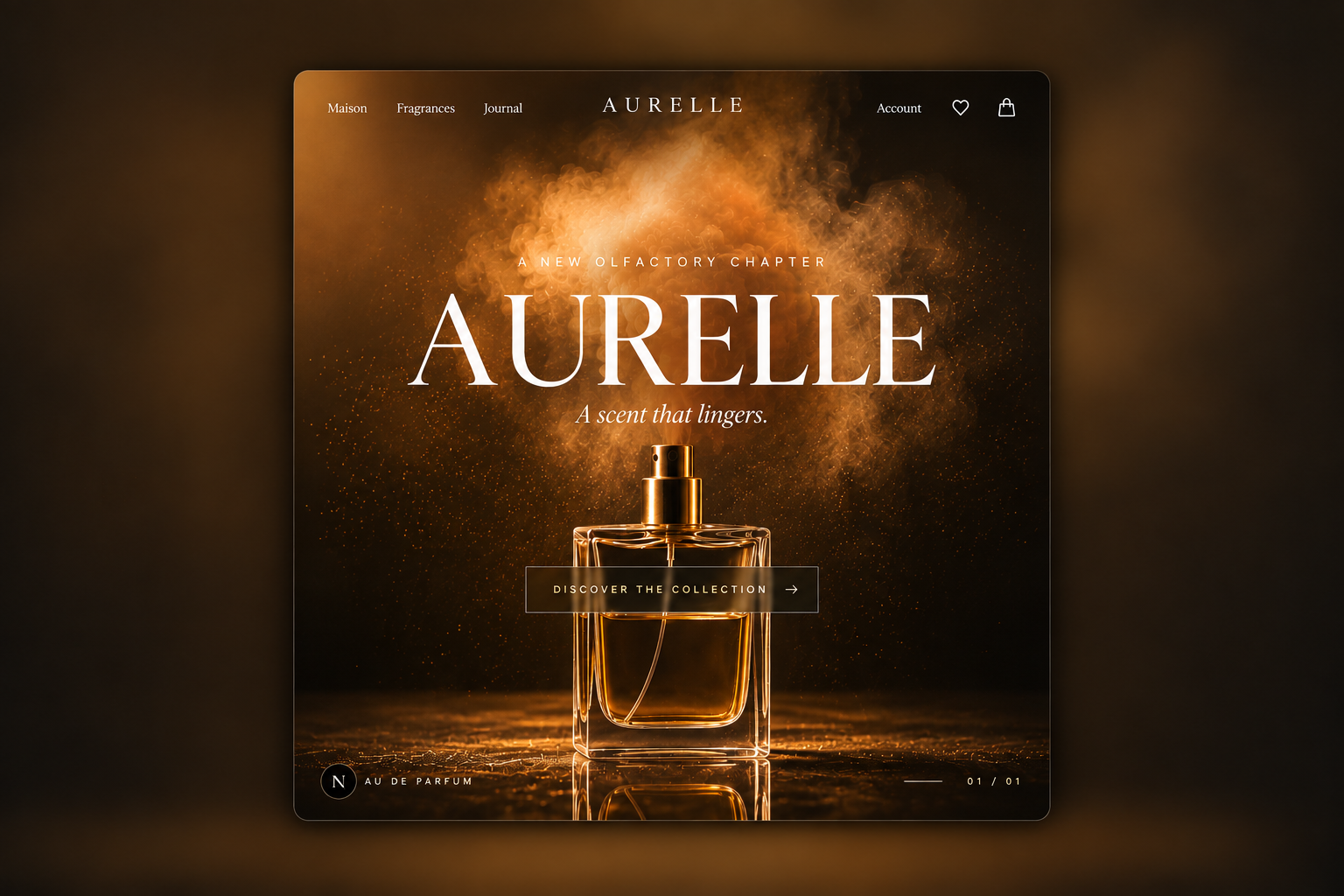
A DIGITAL EXPERIENCE WITH A SCENT OF LUXURY.
A luxury fragrance website concept built around atmosphere, storytelling and visual presence. Warm lighting, refined typography and immersive product imagery create a premium digital experience, while a simple navigation and focused call to action keep the journey clear and effortless.
DESIGNERAnshika
ROLEWeb Design · UI / UX · Art Direction
07DESIGN SYSTEM
DESIGN SYSTEM
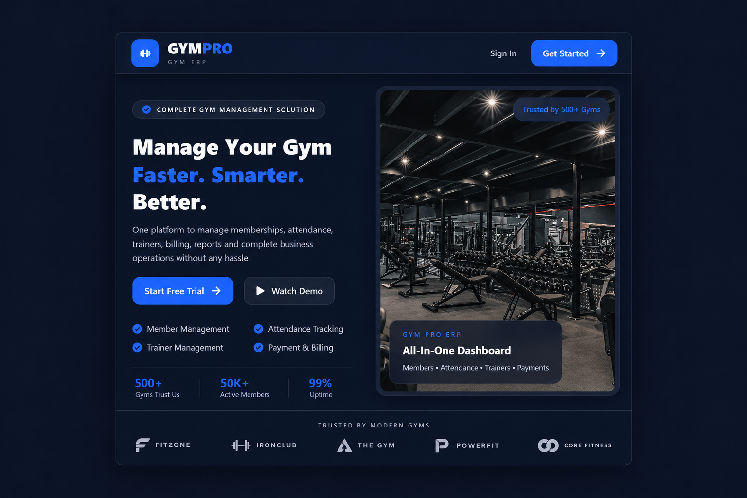
ONE SYSTEM, EVERY DETAIL.
A visual system created for a modern gym management platform, bringing product interface, typography, colour, components and content into one consistent experience. From the navigation and calls to action to dashboards, statistics and feature sections, every element follows the same visual language so the product feels clear, connected and easy to understand.
DESIGNERAnshika
ROLEUI / UX · Design System · Visual Direction
08EDITORIAL / POSTER
EDITORIAL / POSTER
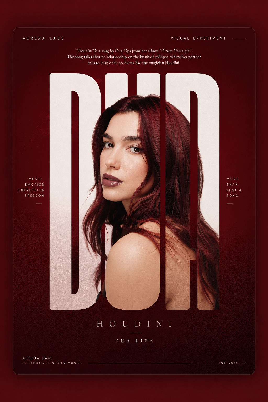
MUSIC IN VISUAL FORM.
A visual poster study exploring how music can be translated into imagery, typography and composition. Bold oversized lettering, a deep red palette and a layered portrait create a dramatic editorial treatment designed to capture the energy and emotion behind a song.
DESIGNERAnshika
ROLEArt Direction · Typography · Visual Design
09UI / UX
UI / UX
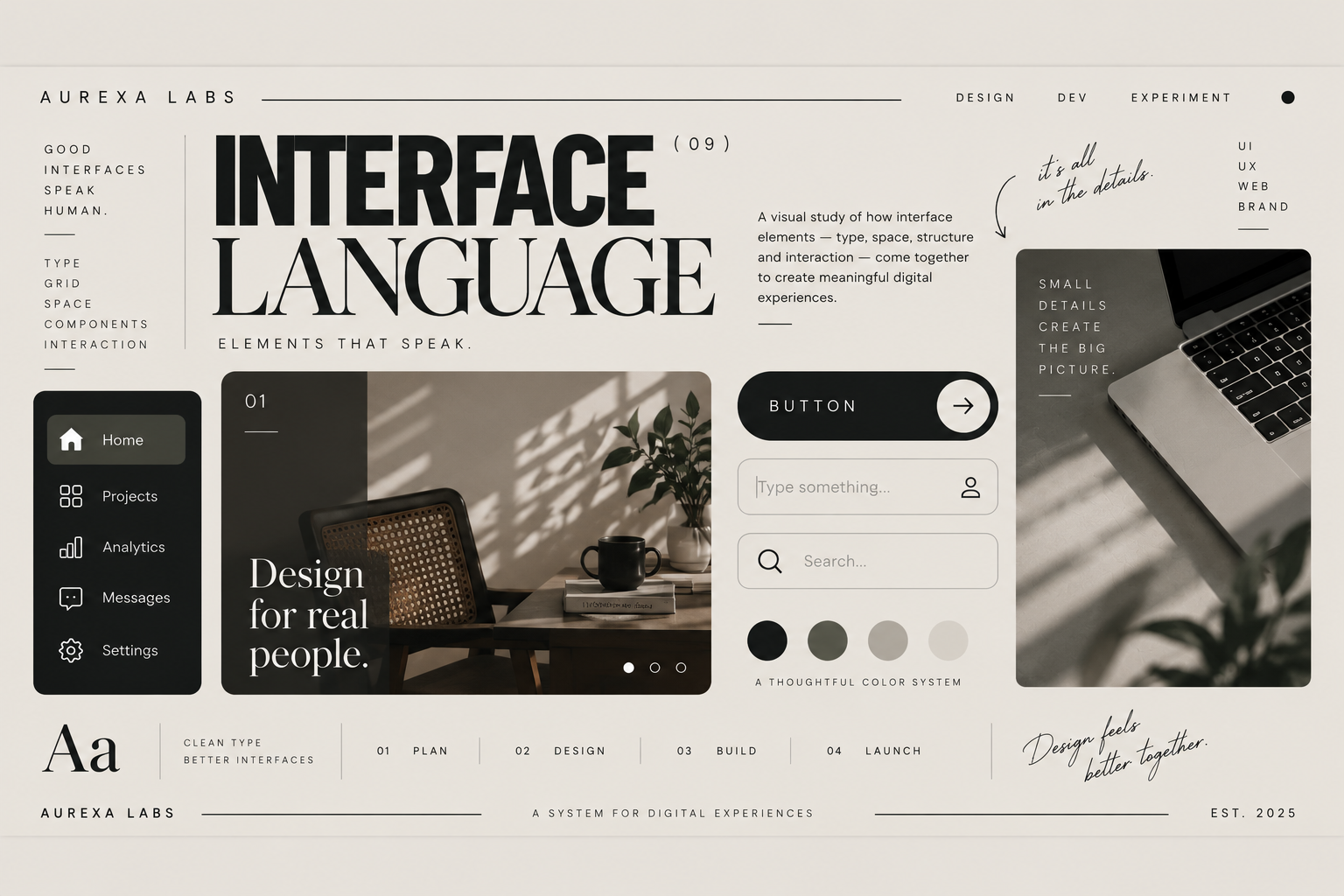
INTERFACE LANGUAGE
A visual exploration of how an interface can communicate through type, structure and small details. Navigation, buttons, inputs, imagery and spacing were brought together into one calm visual language — designed to feel clear, considered and consistent across the experience.
DESIGNERAnshika
ROLEUI / UX · Visual Design
10MOBILE UI / UX
MOBILE UI / UX
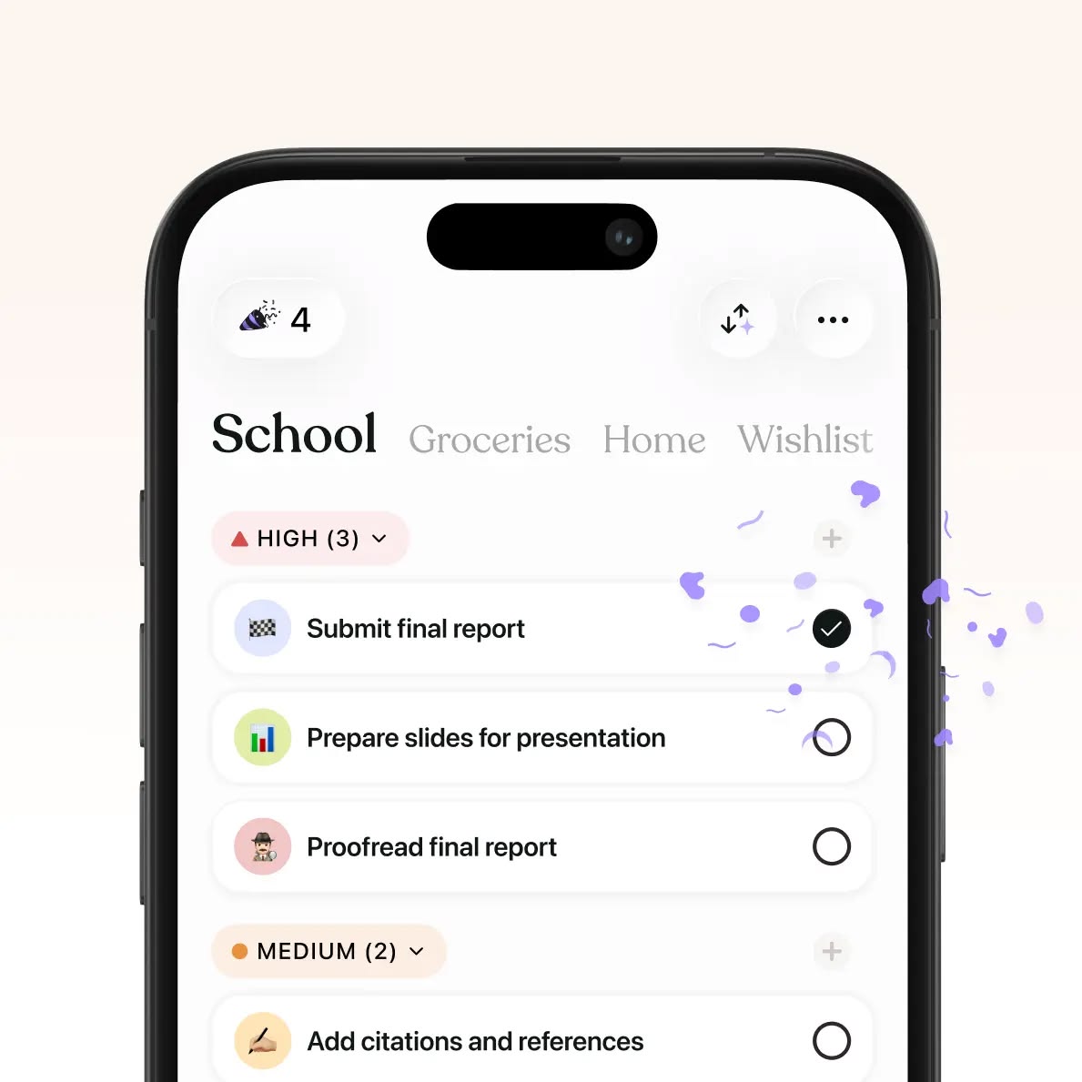
DESIGNED FOR DAILY FLOW.
A mobile interface concept designed to make everyday tasks feel simple, organised and easy to follow. Clear categories, visual priority, familiar interactions and a lightweight layout work together to help users understand what needs attention and move through their day without unnecessary friction.